I was contacted by a friend on Facebook, Lou Riley ( FB ) and asked to review his blog called Lou Riley Live.
The Site – Lou Riley Live
The current website is a blog which serves as a living record of the weight loss journey Lou is undertaking.
I asked Lou the typical pre-review questions, and here are his answers about his blog:
Q: What is your primary goal for this site?
A: My primary goal is to create a movement in the health and wellness industry based on my personal journey as captured on video. So I guess I am building the “Lou Riley Live” brand. I want to draw people into my story and have them subscribe to my blog. Once I establish a “fan” base, I want to convert them into customers for the health and wellness product I am affiliated with.
Q: What do you feel is the biggest weakness of the site at this point?
A: Biggest weakness? A lack of visitors. I also need to improve the process for converting visitors to sales. So far in the videos, I haven’t sold anything. I think that creating this “movement” will make selling easier as visitors will be able to connect with me and not a product. I like the design, but I think some color adjustments can make it better.
Overall, it looks like the goal is going to be to solidify the Lou Riley brand and to bring in more new and repeat visitors. Once he’s got those things, the sales will start coming.
Current State of Affairs
Let’s take a peek at the current Lou Riley Live site:

Sometimes a long screenshot of a website can really tell the story at a glance, and I think we’re seeing that here as well. We’ve got a really big white space in the main content area that’s throwing things off balance, but there are quite a few other things as well.
Let’s Talk Branding
The very first thing we need to talk about is how to make the Lou Riley brand so integral to this site that there is no mistaking what this site is and who it’s by. To do that we need to take two initial steps:
1. Focus on the brand.
2. Remove everything irrelevant.
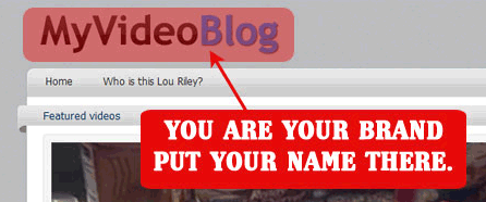
Start building the brand from the very beginning. Put your name at the top, and I’d love to see a photo up there too, something to really push who you are.
Be reachable. People may want to contact you – but more importantly, they want to know that they CAN if they want to.

The second thing about branding, is emphasizing that this site is a video blog. People will go there to see videos. I see the pagination of the videos on the front page as a problem.

The videos stop there, and if I want to scroll through them, I use the navigation there. I have no incentive to keep scrolling down. BUT there’s a lot of stuff in the sidebar further down that I won’t see by stopping there! We need to do that in a different way that doesn’t leave a large empty space in the content area.
Removing The Excess
Let’s just talk about what to take out.
Ditch the entire blogroll section for now.

Remove the login box. You’re the only writer on the blog – and as far as I can tell there’s no members-only material, so this is just taking up space for now. Bookmark the link to login and write posts, no one else really needs this.

Take the Twitter out of your products – this should be in with your social bookmarking links.

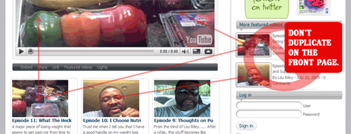
We also want to remove the duplicates. I see that video with the veggies 3 times on the front page of the site. That makes people think there’s very little content – which isn’t true in your case. The recent videos in the sidebar should only show for internal pages (like when I’m on a single post page watching a single video) because then I don’t have to go back to the homepage to see what else you’ve done recently. The featured video should stick at the top, without repeating underneath itself on the homepage.
Personal Product Recommendations
Right now you have two major product selling sections on your site. One in a box like ad section and one in a vertical format down the sidebar.
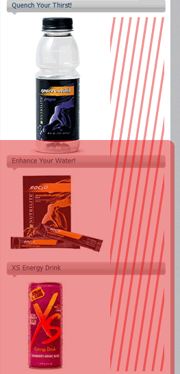
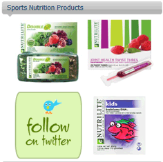
The nutrition ads are okay, they’re small and consolidated (once you remove Twitter you can add a 4th also). The drink ads are a bit of an issue though. They’re too separate, take up too much space, and have a big blank space to the right. Additionally, the first drink is the only one you can see doesn’t show up below the point where the videos stop and people quit scrolling.
I’d like to see you put those drink ads in a similar configuration to your nutrition ads.
Also – give us a reason to trust those products. Rename the sections to personalize it! Maybe instead of calling it ‘Sports Nutrition Products’ you can call it ‘Stuff Lou Is Eating – Certified by Lou to Not Taste Like Powdery Health Food.’
Ok, so maybe you won’t go that far, but we’ll trust your products more if they’re personal recommendations. People who want to lose weight often try to copy a process that was successful for someone else. If you tell them what you recommend – they’ll trust it more (even if you’re not actually using it – although it’s best if you are).
Build Your Fan Base
One of the biggest parts of building a brand is getting people to recognize it through exposure. To do that, you need to build a following.

Your social networking and subscription buttons need to be way up at the top of your page so it’s always being pushed. And hey Lou – we connected on Facebook: You have no Facebook button anywhere on there!
One final note on subscriptions. I’m going to strongly suggest pushing email subscriptions to your blog via Feedburner. I would go with an email subscription textbox signup right in the sidebar.
The reason is – your audience isn’t specifically high-tech users and many people out there are still uncomfortable with feed readers. Email, now that is familiar to most people. Since your site is something that can reach out to many many different kinds of people – I would go with the most universally known way to get updates: email – and push that hard.
Prominent Navigation
I see that you’re using tags for navigation through your video posts. That’s fine – but they’re located too far down. We need to move stuff around on that sidebar to make sure that the primary site navigation is always located high enough that people don’t have to scroll to see it.
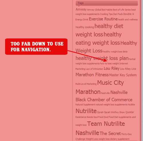
Another note on tags — rename that section to not be called ‘tags.’ I know they’re tags, you know they’re tags, but an inexperienced web user doesn’t know they’re tags. Doesn’t know what they are really. Make it dead simple for people, something like: ‘Topics of the Videos’ and put a little text in there that says something like, ‘Click to see videos on this topic.’
Improve The Look
I really think your site could be better served by a different WordPress theme. I found one online called Videographer that I think you could tweak to really push your brand more. Simple is best, adding is easier than taking away.
The theme looks like this in its bare basics form:
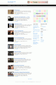
What I really like about this is the way the videos are organized to scroll down in a list that keeps the eye moving and the user scrolling. This allows your sidebar to grow a bit because there is still content in the main section.
The other reason I like this theme is because it is so minimal and open to tweaking.
Playing With Changes
Let me show you what I did in a bit of playing around with this new blank slate.
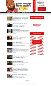
I stole the picture for the header from Lou’s Facebook (great sketch image by the way), and threw it up on top. People like personality and a face to go with a name. Then the name, brand yourself by using a unique font and look for your name.
Don’t consider what I did in the header as a refined or complete — it’s more a sketch of what you could do.
I do think it’s important to add a tagline or quick summary of what this site is about in the header. Also, you’ll see that I’ve moved the social connect buttons up to the top header. This visually associates you with being reachable and real – that’s a good thing.
Now don’t get me wrong, I’m not saying the site needs to stay plain vanilla white and this minimal forever — add a fun background that doesn’t detract from the videos. Add flavor to it in small places, but even if you put out this design on without changing the background or colors: it would put more focus on what the site is about = You, and Your Journey.
However – if you’re really in love with your current theme: ditch the pagination so the page is filled with videos instead of broken down into little bits.
Getting Visitors
The site is doing pretty good on general tech tests. If you want to run your own on your site regularly to see how you are doing, check out Website Grader. I think the biggest thing is going to be promotion.
Digg and bookmark your videos. Maybe write a bit more text about your videos so the search engines have more text to parse for relevance. Keep up the networking. Write some articles on what you suggest to position yourself as an expert and submit them to online article submission sites like Ezine Articles and GoArticles. Make sure your videos are uploaded onto every single video site in existence that will take them and work on building community within those sites. In other words — you’re doing good, just keep trying to get the word out.
Last Thoughts
Lou… I love what you’re doing. I think you are a charismatic man on a mission, and a truly beautiful person for how strong you’re being through this journey of yours.
I think that many people out there will connect with you on so many levels. You could be a symbol of living hope to people who are struggling with the same problem, who have the same desires for a healthier life, and I sincerely hope you keep doing what you’re doing.
Heck, even if you never sell a dime worth of products – I hope you never stop giving the world the opportunity to share in your experiences.
I want you to always feel free to ask any technical web programming or design questions you may have, and I hope that you’ll come back by here from time to time and let us know how it’s going.
My best and most sincere wishes that you succeed in all ways.
~Nicole
Interested in a Site Analysis?
Would you like to have your site reviewed on Beyond Caffeine? Drop me a line and let me know all about it! Do you have a site that you think needs a redesign? Head over to my business site and get your free consultation.
Lou your site was made for me!!! I’ve been trying to loose for so long.