I was contacted by a follower on Twitter, Christopher Francis (@newfocalmedia), and asked to review the New Focal Media website as part of the 4th of July reviews I told my Twitter people about.
The Site – New Focal Media
The New Focal Media site currently has a black and white minimalist design, and operates as a business site with attached blog.
I asked Christopher a couple of questions in order to understand his interest in a site review:
Q: What is your primary goal for this site?
A: The primary goal for the current design was to create a clean, professional portfolio to point potential clients to so they can see some of our work.
Q: What do you feel is the biggest weakness of the site at this point?
A: The biggest weakness is a lack of visitors and no clear call to action to convert visitors to clients or potential clients.
After over 10 years of talking to clients about changes they may need to make – I can tell you that he’s definitely got the advantage of coming into it with a good understanding of the needs and the problem. The goal of the site is a good one, and one of the things that will make it hard to get potential clients from this site is the lack of an action call to get people moving toward being his client. I will address the lack of visitors, as well as some other problems throughout the review.
Current State of Affairs
Let’s start by taking a closer look at the current website design.

At first glance, the site is very minimal, which can be excellent. In this case, if you mouse over the large dim pictures, they use a Flash transition to become more clear and the wording darker.
Let’s take a look at this page visually, not functionally.
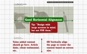
You can see that on the grid, the horizontal alignment is good, but vertically we’re seeing problems. The fact that the site has a huge chunk of white space below the design makes it look incomplete and unbalanced. This is only blatantly evident on high resolution monitors, but as low quality monitors are definitely growing less and less these days, building with a high resolution monitor in mind is important. With it in mind, not for it. You still want to put all your major content ‘above the fold’ so that it can be seen for any resolution of monitor immediately. However, keep in mind how your site looks on high resolution monitors as well.
The two options to make it more balanced are to either shift the design to vertically align itself based on screen size, or to add quality content to the bottom of the page area, or both. I’m suggesting both.
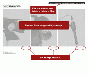
Looking at the homepage, there are some functional changes that should be made. The link to the blog is not functional. I kid you not, it took me over half an hour to realize that was a link. I thought it was a tagline. The main navigation images should not be done in Flash. There is nothing those images are doing that cannot be done with backward compatible Javascript. While it is possible to make some partly accessible Flash movies, in this case, it’s not accessible.
In the new mobile world we live, using Flash as a main component of your site can be a business killer. Many mobile devices (including the very popular iPhone) Do Not Support Flash.
Some people think that since they can view things like YouTube on their iPhone that they must be supporting Flash – but that’s not how it works. YouTube (and many other major sites) actually do a device detection and if you’re visiting from an iPhone, they serve your videos to you in H.264 video streams – not Flash. Of course, the iPhone supports HDTV, but not Flash. In fact, the only mobile browser that’s supposed to support Flash correctly is the relative newcomer – Google Android.
So back to the homepage, the main menu names are too light. I understand that they’re supposed to be dim until you roll over them, but there is too little contrast for it to come close to good readability.
The Work Page
I’m going to skip now to the Work page, because I’m saving the About page for last (I have the most issues with that page).
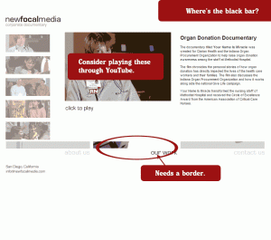
This page isn’t bad from a design perspective. I would absolutely suggest putting those videos on a hosting service instead of serving them up as self-hosted Flash. There’s two reasons for this. The first one is what I already discussed about the problems with Flash on mobile devices. The last thing you want is for people to go check out your work and see a blank page or a page full of errors. Pop those videos up on YouTube and let YouTube handle converting them to a format anyone can read. The second reason to push them to a place like YouTube is that it tells people you are ‘up to date’ on hot trends. Businesses that push video to YouTube for marketing are a step ahead.
When you look at an interior page, you also see that the main navigation picture border just disappears and it should stand out more instead. People need a visual marker of the page they are on. Make it more obvious.
A final note on this page – the black bar at the top is missing on this page. Consistency is important.
The Contact Page
Moving on to the Contact page, I have some suggestions.
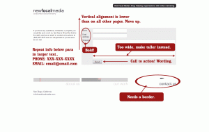
The Contact page isn’t terrible, but needs a few tweaks. Vertically the page has more space between the bottom of the logo and the start of the content than all the other pages. Move up the content to align with the rest of the pages, again – in minimal design, small details become huge. I already discussed the border need for the navigation which applies here as well.
Most important is the need for a major call to action on this page. If you’ve got someone to the Contact page, they’re -this- close to being a potential client. Give them that final push. The text on the left is small. Enlarge it and break down your contact information loud and clear in the space below it.
Make your labels on the contact form bold, and change that ‘Send’ text to say something that really pushes the user like ‘Get Your Free Consultation’. I feel the message box area is too wide and should be taller instead, but that’s a minor aspect.
The Blog
Once I realized the top black bar was a link to a blog, I decided to check out the blog to see how it looks.

Having a blog attached to your business is great! You’re obviously keeping up with best business practices, but when you write about business on your blog – use your blog to promote your business! Put the business logo on the blog to start with. Use an empty space to put your own advertisement on your blog that will send people to your main site. Those two things will help convert readers into buyers. A minor suggestion would be to make your sidebar section headings bold as well.
The About Page
Ok, on to the page I have the most issues with. The About page.
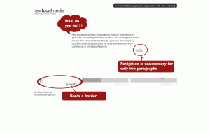
The About page is the most important page on this site, in my opinion. It’s where you get a chance to explain what you do and what you can do for your clients. This page does neither of those.
I have to admit, after a couple of hours of looking at this site to do the review, at the end of it I’m still not sure what New Focal Media DOES exactly. That’s a problem.
I get that they do something with businesses and video. Does New Focal Media consult with businesses about how they can produce more compelling video? Do they arrange employees and customers to give testimonials? Do they edit video to make it more personal? Do they actually shoot the video and organize the shoot with location and equipment? All of the above? I’m not sure.
If I don’t understand what this business does, I could be missing out on a service my business could really use and I wouldn’t know. That’s the site visitor perspective. A business site needs to convince people that they need a service they may or may not even know they needed.
One of the very annoying functional aspects on this page is the arrow to navigate between the two paragraphs. It’s only 2 paragraphs, just put them on one page.
An even better suggestion – the business has something to do with video right? Make a screencast or video! Put it on that page, and explain to me what the business does. Show me the process of working with New Focal Media. Tell me how awesome they are and exactly why my business is never going to make it without them. Build a sense of NEED. Of course, host it on YouTube and let them handle the conversion 🙂
Suggestions For Change
So, let’s get to the final suggestions. I’m going to use the About page as the example for changes to the site.
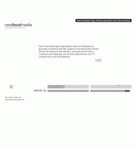
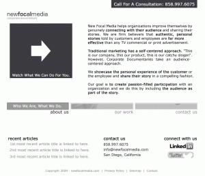
[ NOTE: We already know that the site is aligned nicely on a horizontal line (vertical being the problem) so I’ve trimmed the white space on the sides just to have smaller screenshots. ]
Ok, so let’s talk about the changes I’m suggesting.
Sitewide Change Suggestions
Change 1: The black bar is useless as a blog link. Make it a call to action instead.
Change 2: Enhance the navigation images with some type of border.
Change 3: Make the current page navigation image darker and more obvious.
Change 4: Link to your blog by putting links to recent posts at the bottom (below the fold).
Change 5: I ditched the little email and location bit below the content in favor of a more prominent and bold listing of contact information at the bottom of the page.
Change 6: There are LinkedIn and Twitter links on the blog – show them here too, it reinforces that the business is ‘staying current’ with trends.
Change 7: Added basic (and expected) information at the base footer, like a quick link to the main page, contact page, copyright, etc..
About Page Specific
Change 1: Put the two paragraphs together.
Change 2: Copywriting basics – bold text.
Change 3: A video explaining what New Focal Media does!
I think those changes really make the site look more complete, and consistently push the visitor toward becoming a client.
How about taking it a step further?
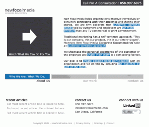
I love LOVE minimal designs, but one of the greatest misconceptions about minimal design is that it means black and white only 🙂 Let’s try really making it pop! How about adding some color to indicate what page you’re on and to emphasize copy? You can even use different colors on different pages. A splash of color will not make this design cluttered. It’s not necessary, but can be fun to play around with to see if it works.
One last change, although it’s actually a pretty big suggestion. Change a couple of page names. ‘About Us’ would be better as ‘What We Do’ and ‘Our Work’ could be ‘The Portfolio’. If you change the names of pages, don’t forget to do some page redirection so the old pages redirect to the new ones. I also suggest adding in your basic sitemap and privacy policy or terms of service.
Visitors and Traffic
There are a variety of reasons this site could be suffering in the traffic department.
The first one involves coding. This site is suffering in the coding department. There are no code headings (H1, H2, etc..) to indicate page structure. Due to that, search engines are likely not reading the page with the elements of importance emphasized because nothing is given a hierarchy. Do some Google searching on HTML Headings and SEO.
Drop down the amount of meta keywords to around 10 or so. A lot of keywords can be seen as an attempt at keyword spam.
The second problem is the homepage Flash. The Flash is making the primary page links into movies with no alternate for search engines to understand. What does that mean? It means that the search engines are ignoring the Flash and only seeing this one page disconnected from the others. The search engines will index the other pages on the site as well, but not as part of the same site, as independent pages. The search engines are not understanding that the home page, about page, work page, and contact are all connected. Ditch the Flash for images that link to the correct pages and add some Javascript afterward to get that transition back – Google will start understanding the site better.
Help the search engines understand your site structure even more by adding a sitemap. Do a quick search online sitemap builders to do this.
The main site doesn’t have an RSS feed attached. Building a new feed just for this site isn’t necessary, there is already a blog. Grab the RSS code from the top of the blog page source and drop it into the main site so that people can subscribe to the articles from there as well.
There is not a permanent redirect set up for the WWW and non-WWW versions of the site. What that means is that instead of there being only one version of your site, there are technically 2: www.newfocalmedia.com and newfocalmedia.com – This is a BIG issue. Google penalizes sites for duplicate content, and having two versions of the same content is seen as exactly that. Redirect the WWW version to the non-WWW version. Do a Google search on how to set up a WWW redirect.
Tell people about it! Sign up on Technorati and list your site there. Get a del.icio.us account and start using it for bookmarking (your site and others, don’t just spam your links only). Submit all your blog articles on Digg – but always submit other peoples articles as well in between! Always tell your social media followers when you have an awesome post, but don’t forget to tell them about other things as well!
Last Thoughts
New Focal Media has a site that has great potential but is just in need of some adjustments to make it more consistent and pack a major punch in the sales department.
Interested In A Site Analysis?
Would you like to have your site reviewed on Beyond Caffeine? Drop me a line and let me know all about it! Do you have a site that you think needs a redesign? Head over to my business site and get your free consultation.
Thanks for the info on the iPhone problems and flahs. Will have to make some changes.
I like the b&w after best.
Nicole,
Thank you for all your hard work and helpful tips. There were several things I didn’t know about (permanent redirect, SEO tips, etc.) that I will be implementing as soon as possible. Other things such as adding the calls to action and other pertinent links to connect through social media that will be of high priority in my coming redesign of the site.
One thing I need to research more is YouTube vs. Vimeo when it comes to SEO. I much prefer Vimeo and was planning on hosting the clips on there as opposed to my own flash player (great tip, btw). However, I assume that since Google owns YouTube it may be more beneficial SEO-wise to host the clips on YouTube. What are your thoughts?
Chris,
I’m glad you read some things in the review that were helpful for your site redesign.
Regarding Vimeo/YouTube..
I always suggest to my clients that if they have video – upload it on every video social media site that will accept it. Once you’ve done that, pick your favorite to share it with your readers.
When it comes to video site community building (like YouTube community pages for your business) – I think YouTube still has a bonus there simply because they have the most users.
~Nicole
Since that Ronaldo posted that he liked the B&W after version best I just had to say I prefer the color after version to make it fair!!! I really do, easier on my old eyes.